Sunday, August 21, 2016

A Bayesian Olympics medals table

As the 2016 Rio Olympics draw to a close, much of the media coverage here in the UK focuses on how many medals Team GB has won, and how this compares to other countries and to previous Olympics. Team GB has done particularly well this year, rising to 2nd in the medal table (as of Sunday afternoon) and increasing the number of medals won compared to London - the first time a host country has improved its medal haul in the subsequent Olympics.

The medal table has become an increasingly prominent feature of the Olympics (at least in the UK). Many people have pointed out an simple flaw in looking at a country’s position in the table as a measure of its sporting ‘quality’ (whatever that means): larger countries win more medals, simply by having more people. The USA, China and in the past the Soviet Union have been large countries dominating the upper echelons of the table. The obvious way to compare countries ‘fairly’ is to look at a per capita medal table. One website that has done this places the Bahamas at the top of its list of per capita gold medals. On the one hand correcting for population size in this way seems like a sensible thing to do if you want to know whether a country performed well for its size or not. But I can’t help noticing that of the top 10 countries in this list, none has a population onf more than 10m people, and two have populations below 1m. A single gold medal in the Bahamas puts them top of the list. This suggests to me that places at the top of the per capita table are likely to be the result of statistical noise - whichever of the many small countries compteting manages to win one gold tops the table.

A more robust solution is to treat the medal table as a statistical sample that is generated from the underlying sporting quality of each country, and to try to infer this quality from the data that we observe. To do this we can use Bayesian inference. Let the quality of a country in Olympic sport be represented by a single number, \(q\), such that the expected number of gold medals that country will win is \(qN\), with \(N\) being the population of the country (I’ll ignore complications about differing proportions of athlete-age population). Bayes’ rule tells us that our belief about the quality of a country should be represented by a probability distribution that combines our prior beliefs about \(q\), \(P(q)\) and the likelihood of observing the medals we saw given a specific value of q, \(P(\textrm{# Golds = g} \mid q)\): \[ P(q \mid \textrm{# Golds = g}) \propto P(q)P(\textrm{# Golds = g} \mid q) \] The likelihood is easy to define. Given that gaining a gold is a rare event, the number of golds won should follow a Poisson distribution. Therefore: \[ P(\textrm{# Golds = g} \mid q) = \frac{(qN)^g \exp(-qN)}{g!} \] For the prior distribution of \(q\) we can use the Principle of Maximum Entropy: we use a distribution that has the most uncertainty given the facts that we know. We know what the mean number of golds per person over the whole world must be, since the total number of golds, \(G\) and the world population, \(N_W\) is fixed at the time of the Olympics. The maximum-entropy distribution defined over positive numbers and with a known mean is the exponential distribution: \[ P(q) = \frac{N_W}{G}\exp(-\frac{qN_W}{G}) \] Putting this together and discarding constants we get \[ P(q \mid \textrm{# Golds = g}) \propto q^g \exp \left(-q\left(N + \frac{N_W}{G}\right) \right) \] If we want a single number to represent this distribution we should use the mean value \(\bar{q} = \int_0^1 qP(q \mid \textrm{# Golds = g}) dq\), which we can calculate as below: \[ \bar{q} = \frac{\int_0^1 q^{g+1} \exp \left(-q\left(N + \frac{N_W}{G}\right)\right)dq}{\int_0^1q^{g} \exp \left(-q\left(N + \frac{N_W}{G}\right)\right)dq} \\ = \frac{g+1}{N + \frac{N_W}{G}}\frac{1-\exp(-(N + \frac{N_W}{G}))\sum_{i=0}^{g+1} \frac{(N + \frac{N_W}{G})^i}{i!}}{1-\exp(-(N + \frac{N_W}{G}))\sum_{i=0}^{g} \frac{(N + \frac{N_W}{G})^i}{i!}} \] where the final step is done using repeated integration by parts. In practice the exponential terms in the final expression tend to be extremely small, so this can be approximated as \(\bar{q} = \frac{g+1}{N + N_W/G}\). This shows what effect the Bayesian prior has: the simple per capita estimate is just \(\frac{g}{N}\); using the prior effectively increases the medal count by 1 and the population count by \(N_W/G\), the worldwide number of people per medal, so it is as if the country got one more gold medal at the cost of having an additional population of the worldwide average needed to do this.

So I’m sure if you’ve slogged through the mathematics this far you’re dying to know what the Bayesian medal table actually looks like. Here is the R code used to do the above calculations, and then finally the medal table:

library(knitr)

#Read in data
medal_table = read.delim("medal_table.txt")
medal_table$Population = as.numeric(gsub(",", "", as.character(medal_table$Population)))


#Define prior distribution mean parameter
world_pop = 7.4e9
prior_mean = sum(medal_table$Gold)/world_pop

#Define useful function for calculating posterior mean
myf <- function(n, k){
  s = rep(0, k)
  for (ii in 0:k){
    s[ii] = -n + ii*log(n) - lfactorial(ii)
  }
  
  y = 1 - sum(exp(s))
  return(y)
}

#Loop over countries and calculate posterior mean 
medal_table$Quality = rep(NA, dim(medal_table)[1])
for (i in 1:dim(medal_table)[1]){
  k = medal_table$Gold[i]
  n = medal_table$Population[i] + 1/prior_mean
  
  #Calculate mean of the posterior distribution
  medal_table$Quality[i] = ((k+1)/n)*myf(n, k+1)/myf(n, k)
  
}

#Order results by quality and print
medal_table_print=medal_table[order(medal_table$Quality, decreasing=TRUE), c("Country", "Gold", "Population", "Quality")]
#Print only countries with quality higher than the prior
medal_table_print = medal_table_print[which(medal_table_print$Quality > prior_mean), ]
row.names(medal_table_print) <-NULL

kable(medal_table_print, digits = 9)
Country Gold Population Quality
Great Britain 27 65138232 3.13e-07
Hungary 8 9844686 2.64e-07
Jamaica 6 2725941 2.60e-07
Netherlands 8 16936520 2.19e-07
Croatia 5 4224404 2.11e-07
Australia 8 23781169 1.88e-07
New Zealand 4 4595700 1.74e-07
Germany 17 81413145 1.70e-07
Cuba 5 11389562 1.69e-07
United States 46 321418820 1.36e-07
South Korea 9 50617045 1.34e-07
Switzerland 3 8286976 1.23e-07
France 10 66808385 1.21e-07
Russian Federation 19 144096812 1.19e-07
Greece 3 10823732 1.14e-07
Spain 7 46418269 1.13e-07
Georgia 2 3679000 1.08e-07
Italy 8 60802085 1.06e-07
Slovakia 2 5424050 1.01e-07
Denmark 2 5676002 1.00e-07
Kenya 6 46050302 1.00e-07
Serbia 2 7098247 9.60e-08
Kazakhstan 3 17544126 9.60e-08
Uzbekistan 4 31299500 9.00e-08
Sweden 2 9798871 8.80e-08
Japan 12 126958472 8.60e-08
Belgium 2 11285721 8.50e-08
Canada 4 35851774 8.30e-08
Bahamas 1 388019 8.10e-08
Fiji 1 892145 8.00e-08
Bahrain 1 1377237 7.80e-08
Kosovo 1 1859203 7.70e-08
Slovenia 1 2063768 7.60e-08
Armenia 1 3017712 7.40e-08
Puerto Rico 1 3474182 7.20e-08
Singapore 1 5535002 6.70e-08
Jordan 1 7594547 6.30e-08
Tajikistan 1 8481855 6.10e-08
North Korea 2 25155317 6.10e-08
Belarus 1 9513000 5.90e-08
Argentina 3 43416755 5.90e-08
Azerbaijan 1 9651349 5.90e-08
Czech Republic 1 10551219 5.80e-08
Colombia 3 48228704 5.50e-08
Poland 2 37999494 4.80e-08
Romania 1 19832389 4.50e-08
Ukraine 2 45198200 4.30e-08
Cote d’Ivoire 1 22701556 4.30e-08
Taiwan 1 23510000 4.20e-08

Team GB tops the chart! Mathematically, this is because GB combines a large rate of medals per capita with a large population. Therefore it has the statistical weight to move the inferred value of \(q\) away from the prior expectation. Smaller countries with several golds like Jamaica also do well, but tiny Bahamas is now much further down the list - 1 gold medal just isn’t enough information to tell you much about the underlying rate at which a country tends to win golds.

You could easily extend this analysis by aggregating the results of previous Olympics too. With data from more years there would be more evidence to move the quality of smaller countries away from the prior. In terms of predicting the future performance of countries you would need to decide on an appropriate weighting of past results, which you could in principle do by trying to make a predictive model for the 2016 results from 2012, 2008 etc. Data from Rio and previous Olympics is available here

Additional note: this is my first blog post written entirely in R Markdown.

Wednesday, August 10, 2016

In defence of the Journal Impact Factor

With the possible exception of the BBC, academia must be the institution that spends the biggest percentage of its time criticising itself. The 'science of science' is an established field of research in its own right. Researcher's have rightly raised awareness of how statistical methods are misused, how career and funding incentives can be better aligned with good scientific practise and the inappropriate use of performance metrics.

Perhaps the most frequent target of criticism in this last category is the Journal Impact Factor (JIF). The JIF is a measure of how many citations papers in a specific journal tend to receive. Precisely, it is defined as the mean number of citations received in the last year by articles published in the journal in the previous two years.

A list of common complaints about the JIF would include:
  1. Citation distributions are skewed, with many papers receiving few citations and a few papers receiving many citations. As such the JIF is a poor representation of a 'typical' paper in the journal.
  2. The JIF is a statistic of relevance to the journal, but is inappropriately used to judge individual papers or researchers, which are better judged by their own number of citations.
  3. Journals' pursuit of higher JIF scores biases them towards eye-catching papers and positive results, rather than solid research, replication studies and negative results
  4. Journals engage in dodgy practices in order to artificially inflate their JIF
I don't hold any great admiration for the JIF, but my instinctive contrarianism has made me skeptical about these complaints. As an exercise in devil's advocacy, I'll try and give answers to each of them.

1. Citation distributions certainly are skewed. So are lots of things. People's salaries, for instance, are highly skewed. Take a look at this plot of household income from Wikipedia
That huge bar on the right hand side indicates a long tail of households with very high incomes. Because of this the mean income is about 20% higher than the median. This skew is more pronounced in some countries than others: The US and the UK have substantially more income inequality than most continental European countries for instance. As such one should treat differences in the mean income between countries with a little caution - the higher mean income in the US compared to most European countries is predominantly due to a small number of wealthy individuals. That being said, do we seriously doubt that there is a difference between a country with a mean income of $50,000 a year and one with $10,000 a year? Clearly mean incomes tell us something about the quality of life in different countries, the prospects of their citizens, their overall clout in the world. Compare the plot above with the distribution of citations to two journals, also from Wikipedia. They have the same basic features.


Sure, it may be daft to claim that a journal with a JIF of 5 is substantially different to one with a JIF of 4.5. One should not fetishise irrelevant differences just because they are presented with apparently high precision. But the truth of the matter is that knowing that one paper was published in a high JIF journal and another in a low JIF journal gives you some information about the likely quality of each. There will be many exceptions where bad papers appear in good journals and vice versa. But as long as it provides some information people will continue to use it. Seeking to banish impact factors from discussion will only make this use more opaque.

The skewed nature of the distribution introduces a lot of uncertainty into the statistics of estimating a population mean. It is often stated that because citations follow an approximate power-law distribution the mean of the distribution has no descriptive value. This is untrue. Estimates of the power-law coefficient are generally in excess of 3, meaning that both the mean and variance of the distribution are well defined. As such the Law of Large Numbers and the Central Limit Theorem apply and the sample mean converges to the underlying mean of the distribution, with normally distributed uncertainty. Therefore the JIF does what it says on the tin: gives a reasonable estimate of the expected number of citations a paper in that journal will receive.

For describing what is likely to happen to a single paper, the median may have been a better measure to use than the mean. But few people are claiming that a switch from mean to median would fix their issues with the JIF. 

2. This is the point I take most issue with. In a recent pre-print paper on Biorxiv.org relating to the use of JIFs, the authors claim in their abstract that:

Although there are differences among journals across the spectrum of JIFs, the citation distributions overlap extensively, demonstrating that the citation performance of individual papers cannot be inferred from the JIF.

This obviously relates strongly to the discussion of point 1. To what extent can I predict how many citations a paper will receive, based on the JIF of the publishing journal?

Overlapping distributions. A simple reposte to the above quote is that just because distributions overlap does make them useless. The distributions in height of men and women overlap a lot. There are many men below 5ft 8' tall and many women taller than 5ft 10'. Nonetheless, the mean height of a man is significantly greater than the mean height of a woman, and knowing someone's gender gives you a lot of predictive power when estimating their height. Likewise there are plenty of people in developing countries who have incomes greater than the average British worker, but no one thinks the country someone lives in is irrelevant in determining their income. The case of JIFs is only different from this examples in the quantitative degree of overlap. Since JIFs are relatively stable over time, by definition the JIF must give accurate information about the expected number of citations a paper will receive. Indeed, studies show that the JIF is a better predictor of the citations a paper will receive than subjective judgements about paper quality. Unless the JIF was fluctuating wildly over time this simply has to be true. 

Journal level vs article-level metrics. My major gripe about this point is not whether or not the JIF is a useful predictor of the number of citations a paper will get. It is the idea that the actual number of citations received is somehow a superior estimate of a paper's quality. New publication houses such as the Public Library of Science like to champion 'article-level metrics' over the JIF, arguing that the paper should be judged independently of the journal it is in. If we lived in a world where everyone took the trouble to read, consider and evaluate papers in their entirety, I'd be perfectly happy to get on the ditch-the-JIF bandwagon. But that simply isn't going to happen. If we stop looking at the journal metrics we are left looking at article-level metrics such as number of citations or social-media response. But the very arguments against JIFs are at least as valid against article-level metrics. The highly skewed distribution of citations is not necessarily due to a highly skewed distribution of article quality, but reflects the nature (or Nature?) of the science citation game. The simplest explanation for this skew is that papers with many citations tend to be cited more in future. This could be because they are intrinsically better papers, but the effect tends to be exponential rather than linear in time, suggesting the appearance of the paper in references adds to its salience for future citers. Moreover, papers with famous authors, papers with lots of co-authors and papers in popular areas tend to receive more citations. Untangling quality effects from random noise is extremely difficult. Do I think citation metrics are useless? No. But are they a clean estimate of a single paper's quality relative to other work. Not at all. 

Citation-process noise reduction and new papers. In fact, in my opinion the JIF is superior to article-level citations in many instances. Consider that if a paper is published in, say, PNAS, several referees have read the paper in detail (hopefully) and decided that it is a piece of work that meets the general standards of that journal. The JIF of PNAS (which is about 9) then does the useful statistical job of averaging over all papers that meet that standard, removing a lot of noise in the process, and telling us something about how good the average paper meeting those standards is. In science we usually favour statistics from large sample sizes rather than single data points. Why should you be punished because your excellent paper wasn't one of the few runaway citation successes? Is the JIF perfect? Of course not! Publication in leading journals is also biased towards established leading scientists and their proteges, to native English-speakers, etc. Using the median would probably be more informative about the prospects of a 'typical' paper. But is it better to use only the citations to a specific article? Absolutely not. For one thing, the journal a paper is published gives immediate information about the paper, whereas citations can take years to build up. For researchers with few previous papers (I refuse to use the term Early Career Researchers, which seems to apply to anyone below 50 now), this can make a serious difference.

3. Journal's want people to read them, or more importantly they want librarians to subscribe to them. As long as journals make their money from subscriptions they will always want eye-catching results, and forever neglect less glamorous work, especially in the journals that leading publication houses use as the eye-candy to get people to subscribe on-mass to their less read titles. Trying to increase their JIF scores is a much a symptom of this problem as it is a cause. 

Librarians simply are not going to look at the full distribution of citations from a journal when making subscription decisions. They want a few or ideally one number to use to make that choice. We could, for instance, redefine the JIF to be based on the median number of citations. This might stop top journals chasing a few geese that lay the golden eggs of mega-citations (which seem to be far more likely to later be proved flawed or even retracted). But ultimately journals will always want research that is more likely to be read and cited. I am more concerned with the mountains of academic research published at great expense and hardly ever read

The only exception to this rule is journals that receive all their money from authors paying to publish. PLoS One charges about $1500 per article to authors for publication, and promises to publish anything that is technically correct. I will leave the reader to guess whether I think this is a good idea. (I used to publish in PLoS One, but now I conveniently can't afford to do so anymore).

Personally I'm broadly in favour of more open science (not capitalised), and the use of open repositories such as Arxiv and Biorxiv. I'm interested in the possibilities of formalised post-publication review. I think the amount of money spent on academic publishing is a disgrace. Everyone should learn to typeset their own papers properly as is standard in computer science fields. I hear about and read most papers as a result of the Twitter grapevine rather than browsing particular journals, but this is process subject to a whole load of biases of its own

4. Goodhart's law. Whatever metric you choose as a proxy for quality will become corrupted if rewards accrue to those with higher scores. Gaming is all but inevitable. Perfectly reasonable standards of behaviour should be adopted, such as counting papers as being published when they first appear online rather than much later in print. The best way to ensure this is to shun journal's that obviously engage in dodgy practices. Almost no one is going to do this if the journal is a leader in their field. You already know a rough order of journal quality in your field, so gaming tactics that add a few points to the JIF should not unduly trouble you.

Ultimately the best way to judge a paper is to read it. Within our respective fields we all know what a 'good' journal is, and what it takes to be published there. Anyone who judges a researcher or makes a hiring decision by simply adding up the JIFs of all their papers is a fool. So is someone making the same decision based on total citations or the h-index. The data is now  accessible about the detailed citation distributions in various leading journals. So if you want to find out which journal gives you the best chance of getting that h-index-improving n citations you can.

The 'game' of a scientific career is noisy, prejudiced, unfair and no sure way to health, wealth and happiness. The same is true of almost any career. Do work you believe in and enjoy, make reasonable adjustments to adapt to the system and don't make becoming a professor at a top institution or publishing in Science or Nature your only goals in life. This much is obvious. But the JIF is no more flawed than any other reductionist metric of outputs, and getting rid of it will, in and of itself, solve absolutely nothing.


Friday, August 5, 2016

A few fascinating laws and paradoxes

I recently spent an evening discussing the time-reversibility in Newtonian mechanics through the medium of 140 character tweets, after being introduced to one of my favourite things: a new paradox (hat tip to @MikeBenchCapon). This reminded me that there can be no excuse to be bored in this day and age when you can spend happy hours perusing the lists of eponymous laws and of paradoxes on Wikipedia. Here are a few of my favourites eponymous laws from those lists and elsewhere:

Benford's law: on the power-law distribution of specific digits in naturally occurring statistics.  The most commonly quoted part of the law is that about 30% of all statistics will start with the digit 1, compared to a naive expectation of around 11%. This law was used to show that Iran had been fabricating data relating to its nuclear program, since the digits in the data did not follow Benford's law. My favourite aspect of the law is that it can be derived from the assumption that if there does exist a distribution for the digits, it must be independent of the numerical basis used to represent the statistics.

Baumol's cost disease: why the cost of doctors, teachers and other service professionals increases over time. The efficiency of manufacturing has historically progressed faster than service sector occupations such as health care and education, through mechanisation. Instead of raising the salaries of manufacturing workers faster than service workers, all salaries tend to grow at roughly the same rate. As a result, labour-intensive industries become more costly over time relative to the price of manufactured goods. Expect tuition fees to carry on rising.

Goodhart's law: why you can't measure how well an intelligent system performs if you reward it for that performance (see also Campbell's law). Academics will be familiar with the gaming of league tables and the UK Research Excellence Framework by their institutions. When a body such as the government decides on metrics as a proxy to measure performance, and then rewards those who perform well by these measures, individuals choose to target the measures rather than genuinely improving overall performance. Hence we get teachers teaching-to-test, universities gaming the REF, scientists prioritising citations over true advances, and hospitals playing games with patient waiting times.

And of course Stigler's law of eponymy, which states that these laws were probably not named after the people who discovered them first. Stigler was, of course, not the first to propose this.

Here are a few of my favourites paradoxes, along with a rating for how genuinely paradoxical they seem to me:

Berkson's paradox: why the best-looking people you date have the worst personalities. While beautiful people may be no more or less pleasant in the population as a whole, you will let a bad personality slide for a beautiful mate, or date someone below your usual standards of physical beauty if they have a sparkling wit. As a result, in the group of people you date there will be an inverse correlation between beauty and personality. Paradox rating 1/10

The friendship paradox: why your friends probably are more successful and have more friends than you do. It is a simple result of networkm theory that you are most likely to be friends with people who have lots of friends, since they have more friendship links available. This means that a typical person is connected to people who have more friends than they do (while a few individuals are connected to lots of people with fewer friends). A simple corrolary is that if more successful people have more friends, then your friends will, on average, be more successful than you. In science, this selection effect is why everyone you know seems to be doing better than you are - the better they are doing, the more likely you are to be aware of them. Paradox rating 3/10

The envelope paradox: how a simple game tests the bounds of probability theory. A game show host offers you two envelopes and tells you that one contains twice as much money as the other. You open one envelope and find it contains £10. The other must contain either £5 or £20, with an average of £12.5. When the host offers to let you switch it seems that you should. But that choice would have been the same if you had never opened the envelope. The next time you don't even bother to open the envelope before switching, but now the same logic applies to the new envelope, making you switch back and forth forever. What has gone wrong? Paradox rating 7/10

Norton's dome: Theoretical departure from causality in Newtonian physics. A point mass sits atop a radially-symmetric, frictionless dome, with no force acting on it. After some arbitrary amount of time it begins to move spontaneously and rolls down the side of the dome. Its motion nonetheless obeys Newton's laws at all times, despite there being no way to predict, or even place probabilities on, the time elapsed before it starts to roll. Paradox rating 9/10

Monday, July 18, 2016

Will your job be automated? A critique of the predictions of Frey and Osborne

You cannot have failed to encounter the current hype and/or panic about job automation. The basic story is compelling. Drawing on the availability of Big Data, artificial intelligence is progressing at a breakneck speed, solving problems that once seemed like science fiction: driverless cars, recognising people in photos, giving eerily accurate suggestions about which films we might want to watch or even what email replies we might want to give. More mundane tasks that were once the preserve of highly-trained professionals are also at risk, such as legal research. A computer can scan millions of legal texts for relevant information while a lawyer is still finding the reference for the text they need.

All of this has led to a widespread belief that many people face the loss of their job in the near future. Of course, automation has been with us since the industrial revolution, and in some areas even before then. Resistance to, and despair about automation is as old as automation itself. But the new panic is about the possible scale of job losses, and the lack of useful employment opportunities for those displaced. An oft-quoted figure is that 47% of U.S. jobs are at risk of automation.

The figure of 47% originates in the work of Carl Frey and Michael Osborne, of Oxford University. Frey and Osborne persuasively argue that the progress in data collection, data analytics and artificial intelligence puts many tasks that were previously thought to be out of reach for computers and robots within touching distance of being automated. They contend that advances in pattern recognition mean that computers, which previously had been used to automate routine tasks, such as performing repeated calculations or fitting parts together in factories, will increasingly be able to tackle non-routine tasks. For example, Siri and similar artificial personal assistants take in unstructured voice requests and determine what the user wants, where to seek the required information and how to present it to them. With enough data, they suggest, almost any task can be automated by looking for patterns in the data that inform the task at hand:

"...we argue that it is largely already technologically possible to automate almost any task, provided that sufficient amounts of data are gathered for pattern recognition." [F&O]

These arguments are persuasive, and there is no doubt that modern machine-learning research has made great strides - it is worth trying to recall how outlandish some of today's AI technologies would have seemed just 10 years ago. Nonetheless, others such as Neil Lawrence, of Sheffield University, have argued that relying on huge data sets in this way is not the same thing as true artificial intelligence. Only a few organisations in the world such as Google and Facebook have access to truly vast amounts of data about our daily behaviours, and a great deal of their research is dedicated to targeting adverts at us with increasing precision. Moreover, if a computer needs a vast data set to learn what it should do, how readily can it adapt to new tasks? Will there always be a big enough relevant data set that has, or even could be collected? What about tasks where the computer may not have access to 'the grid' and the vast centres where data is stored? These are big questions that drive significant bodies of research in AI. Given these uncertainties, it is worth considering how F&O arrive at the rather precise number of 47% for the proportion of jobs at risk.

Fittingly enough, F&O use machine-learning itself to determine whether a job is automatable. They use a tool called Gaussian process classification (GPC) to predict whether a job is automatable, based on the characteristics of that job, as defined and measured in a data set called O*NET, collected by the US Department of Labor. O*NET lists the skills and knowledge required to perform each job. To use GPC to make predictions requires two things, a set of predictors (in this case the O*NET data) and a matching set of known outputs on which to train the classifier. In plain terms, they require not only the job characteristics, but also, for some of these jobs, a known risk of automation. Where does this second part come from? In short, they make an educated guess (or more precisely, they ask a group of well-informed people to make such a guess). In the paper they describe this process:

"First,  together with a group of ML researchers, we subjectively hand-labelled 70 occupations, assigning 1 if automatable, and 0 if not. For our subjective assessments, we draw upon a workshop held at the Oxford University Engineering Sciences Department, examining the automatability of a wide range of tasks. Our label assignments were based on eyeballing the O∗NET tasks and job description of each occupation. This information is particular to each occupation, as opposed to standardised across different jobs. The hand-labelling of the occupations was made by answering the question “Can the tasks of this job be sufficiently specified, conditional on the availability of big data, to be performed by state of the art computer-controlled equipment”. [F&O]

To make the process plain, they took 70 of the jobs in the data set about which they were most confident, and made their best guess as to whether these were going to be automated. They then use the GPC to translate these subjective opinions about 70 jobs into predictions on the other 600 or so in the data set. Essentially they train the GPC to learn what it is about certain jobs that makes them believe they will be automated. Ultimately then, the GPC propagates this subjective opinion to all the other jobs, and determines that 47% are predicted to be automated.

As a side effect, the GPC is also able to identify the factors that seemed to influence whether the workshop participants thought a job would be automated. The factors identified seem reasonable: jobs requiring high social perceptiveness have a low risk for example. But we should perhaps treat these findings with care - the very fact that they seem reasonable to us suggests that they also seemed reasonable to the people making the predictions - no wonder then that they labelled jobs requiring high social perceptiveness as less likely to be automated. Moreover, while the participants of a workshop at the Oxford University Engineering Sciences Department no doubt have greater expertise than the average person in determining the capabilities of machines, we should also be aware that such groups are somewhat selective to technological optimism - few people choose to become researchers in artificial intelligence if they do not believe it is important, any more than you would become a teacher if you didn't think education made a difference. Any biases or blind spots these individuals might have will be translated into the final figure of 47%, as well as the characteristics chosen as most important.

There is a danger when reading the paper (if one does, no doubt many news sources do not), that one can be impressed by the mathematical sophistication of the GPC prediction machinery. It is an impressive piece of technical work. But the GPC can only work with what is is given - it generalises from known examples in the data. The old saying about computer science: 'garbage in, garbage out' is overly pejorative here - the predictions the GPC has been trained on are not garbage, but the best educated guesses of well informed people. They are internally consistent - the GPC can predict well the predictions made by workshop participants for unseen examples. But the GPC cannot predict more accurately than the individuals themselves. It is important to realise that the trained-GPC is effective a machine for making the predictions these same individuals would have made themselves if they were asked. With all the uncertainties involved in a still nascent and quickly changing field, making precise predictions is extremely speculative. Just imagine how different many of these predictions would have been if people had been asked 10 years ago. What might they look like in 10 years time?

All of this makes me very skeptical about the now ubiquitous assumption that masses job losses are inevitable. In many ways I hope they are - we should hope that more of the tasks we only do out of necessity will be automated, as long as the economic gains can be spread equitably (a whole other ball game!). But a narrative of huge disruption feeds into the rather millennial milieu in which we find ourselves, plagued with doubts about our economic system, possible catastrophic climate change, antibiotic resistance etc. It is very tempting to believe that disruptive, destructive change is now a permanent feature of our lives. F&O, to their credit, do not take this line - I have seen Michael Osborne present his work previously and he speaks to all great possibilities automation creates. It is also worth noting that many tasks that can be automated take an amazingly long time to be so. I recently took a trip to the National Coal Mining Museum, where I was amazed to learn that very few mines had any serious machinery involved in the actual hacking off of coal until nationalisation and unionisation drove up labour costs and pushed efficiency up the agenda after the war. I'm perpetually amazed, as a renter, how many people think dishwashers are optional! As Frey & Osborne note, but few news outlets pick up on, automation will only happen if the cost of labour is sufficiently high - many government policies are directed explicitly at lowering the cost of labour to the employer.

We shall no doubt see feats of automation in our lifetimes that would stagger us today, just as the household appliances created in the 20th century would amaze our ancestors. But exactly which jobs will disappear, when they will do so and how many people will become unemployed? I would not want to guess.

Reference: [F&O] The future of employment: How susceptible are jobs to computerisation? Carl Benedikt Frey and Michael A. Osborne
   

Wednesday, July 13, 2016

Brexit: a statistical demographic analysis

Britain voted for Brexit, defying the predictions from Betfair's prediction market. I was in the US at the time, giving me the dubious privilege of watching the votes come in without having to stay up all night. As a (relatively) young, (relatively) affluent graduate and resident of a major UK city you will be completely unsurprised to learn that I voted to remain.

There has been a lot of discussion in the press since the vote regarding different demographic splits between remain and leave voters. We are told that city-dwellers, graduates, the young and the affluent tended to vote remain, while poorer voters, those in small towns and villages, those without higher education and older voters tended to vote leave. The Scottish and the Irish voted in, the English and the Welsh voted out. The Guardian provides a breakdown of these trends, which appear to show a nation divided. I assume the data they use comes from the 2011 UK Census.

In an effort to channel my increasing angst in a positive direction I set out to do a more thorough statistical analysis of the data The Guardian presented to identify which demographic factors were most important in determining how people voted. After scraping the data from the Guardian website I first reproduced the graphs The Guardian had displayed (see end for scraping details. NB: I could have aggregated data from the UK Census directly, but this was quicker and ensured I was using exactly the same measures as the Guardian). My demographic data are all in arbitrary units since I had to scrape the values in pixel units from the webpage, but since this won't affect the statistics I wish to do - in fact, scaling each demographic variable to lie between 0 and 1 helps us to compare the magnitude of effects. On each subplot I have given the correlation coefficient between the demographic indicator and the proportion of leave voters.

 In short these plots (working left to right and top to bottom) seem to indicate that:
  1. Voters with degrees tend to vote remain
  2. Voters with no formal qualifications tend to vote leave
  3. Voters with higher incomes tend to vote remain
  4. Voters in the ABC1 classes tend to vote remain
  5. Older voters tend to vote leave
  6. Voters in areas with more non-UK born residents tend to vote remain
So far, so much in agreement with the general terms of discussion. How do these perceptions hold up when we actually do some statistics on the data?

The tool I used for this analysis is the Generalised Linear Mixed Effects Model.  I specified the model as:

proportion voting leave ~ (1 | Region) + proportion with higher education. + proportion with no formal qualifications + median income + proportion in ABC1 social classes + median age + proportion not born in UK

This model states that the proportion of leave voters in an electoral area is determined by the demographic characteristics plotted above, but with regional variations specified by the random effect (1 | Region). We know that each nation of the UK had distinctly different voting patterns, quite separate from their different demographics, e.g. older voters in Scotland didn't necessarily vote the same way as similarly-aged voters in England. We'd better account for this in the analysis if we want to identify the real underlying effects.

Running this model in R (lme4::glmer, scaling the independent variables to have zero mean and unit standard deviation) we infer estimated effect sizes for each of the demographic variables. Below I've listed these and plotted the effect sizes with 95% confidence intervals for visual comparison. Points plotted to the left of the vertical grey line indicate a negative affect on the leave vote, those on the right a positive effect.


Some of the initial impressions from the data are born out in this analysis. The intercept is weakly positive, indicating that overall the nation voted to leave (albeit by such a slim margin that the intercept is not significantly greater than zero! - worth noting by those claiming an uncontestable mandate). By far the most important predictor of how an individual will vote is whether or not they have had any higher education. Older voters do tend to vote leave in greater numbers (in fact this tendency is shown more strongly here than we saw in the first set of plots). But some of the other results are surprising. The proportion of residents who are not born in the UK has a negligible effect on how that area will vote. Class has a relatively weak effect despite showing one of the strongest correlations. Voters with higher incomes are more likely to vote leave (all other things being equal). Perhaps most surprising, areas where more people have no formal qualifications are substantially less likely to vote leave (again, all other things being equal). The strong positive correlation seen between proportion with no formal qualification and leave vote seen in the first figure appears to be a side effect of the strong anti-correlation between the proportion with no formal qualification and the proportion with higher education. 

Of course, that caveat all other things being equal is doing a lot of work. Its rare to find someone with a high income, but with no higher education and who would not be classified as being in the ABC1 social classes. Likewise there are not many areas where there are simultaneously a large number of graduates and a large number of people without formal qualifications. Nonetheless, the differences between the statistical results and the original impression from the data plots should make us pause before reading too much into the apparent demographic trends.

This analysis was a simple effort with a readily available model - hopefully some more sophisticated analysis will reveal a clearer picture. In particular, including interactions between these different indicators may give better predictions. As usual in such analyses, we should be aware of all the caveats surrounding ecological regression - data based on individual characteristics would be preferable, but that may be a pipedream.

How I got the data: scraping, xml and awk

The Guardian is one of the best newspapers in the world for presenting real data and analysis to the public. That it is free to access is an amazing privilege for those of us who are interested in the real evidence behind the headlines. It regularly presents beautiful summaries of important data in an easily understood format. 

However, on this page where the demographic data is plotted, there is no information on how one might view the original data is numerical form. That is the newspaper's prerogative, and may be due to worries that other publications would piggyback on the hard work Guardian journalists do in finding the information. It does however make Open Science difficult.

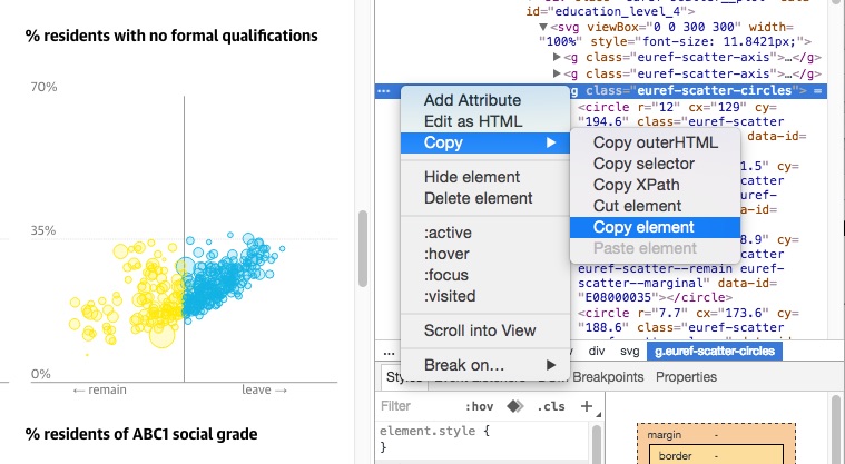
To get the data I needed I first inspected the elements comprising the interactive plot (in Chrome, right click: inspect)


Then I found the xml entries that gave the screen coordinates for each circle plotted on each graph


I copied this element, which specifies the location of each circle and, thankfully, a code for the electoral area, into a text file, getting text that looks like this:


To get the raw x, y positions for each circle I processed this text file using an awk script (credit for awk-ing goes to Roman Garnett). Using an xml processing tool may be more efficient (or at least more sensible).

awk 'BEGIN {RS="<"} /^circle/ {gsub("[[:punct:]]", " "); gsub("data id", "dataid"); for (i = 1; i <= NF; i++) {if ($i ~ "cx" || $i ~ "cy" || $i ~ "dataid") {printf "%s ", $(i + 1)}} printf "\n"}' input_file >> output_file

I rescaled these data so that every demographic indicator lies between 0 and 1, and then matched these data with far more easily obtainable data on how each electoral area voted from The Electoral Commission. (NB: the raw numbers are inverted in scale when collected from the website, because they indicate pixel positions from the top of the graph element.)

I am a little uncertain on whether one should make this data openly accessible. On the one hand the raw numbers I used are all publicly accessible on The Guardian's webpage (with a bit of work!), and could in principle be retrieved from the UK Census. On the other hand The Guardian didn't publish the numerical data, and so I will respect that and not do so here. These instructions should be sufficient to allow you to get the data yourself should you wish, and I would suggest contacting The Guardian if you want to do anything remotely commercial with them.


Sunday, June 19, 2016

Predicting the Brexit vote from the betting market with R

There is currently an intriguing (one might say terrifying) mismatch between the many opinion polls on the coming EU referendum and the betting markets. The poll analysis website http://whatukthinksthinks.org /eu presents a 'poll of polls' that puts Remain and Leave neck and neck at 50%-50%, but on betfair.com the implied probability of a remain vote is (as of 12pm on June 19) 70%.

Tight polls don't necessarily mean the outcome is uncertain. If every poll gave Remain 51% and Leave 49% then we could be quite confident that Remain would win - they only need 50% + 1 vote. When the vote arrives, if 51% say Remain then we can be 100% sure that Remain has won.

But how to compare directly what the polls and betting markets think? The main betting market indicates the probability that Remain or Leave will win, not their respective vote shares. But in a sub-market one can bet on the vote shares themselves, generally in 5% intervals. Using the odds on this market we can find out what the betting market thinks (on average) the Remain vote share will be.

At the moment this sub-market looks like this:


We can take the average of the blue and pink numbers for each percentile as estimates of the reciprocal of the cumulative distribution function (CDF) of the vote share. These are quite coarsely spread at 5% intervals, so to get a better idea what the true CDF looks like we can fit a Beta Distribution to these numbers. A Beta Distribution is a general distribution for describing quantities that can take values between 0 and 1, just like the vote share. In R:


x = c(seq(0.4, 0.7, 0.05), 1)#voting percentiles from betfair
iy = c(28.5, 17.5,  5.05, 2.95,  3.83, 11.5, 52.5, 92.5)#betfair odds for each segment
y = 1/iy #Get estimated PDF points from odds
Y = cumsum(y)#get CDF points from PDF
objective_fn <- function(parameters) sum((Y-pbeta(x, parameters[1], parameters[2]))^2) #Create a sqaure error objective to minimise
best_parameters = optim(par=c(1,1), fn = objective_fn) #Get minimising parameters
plot(x, Y, xlab="x", ylab="P(Vote share < x)")
z = seq(0,1, length.out=100)
lines(z, pbeta(z, best_parameters$par[1], best_parameters$par[2]))
print(paste(c("Expected Remain vote: ", best_parameters$par[1]/(best_parameters$par[1]+best_parameters$par[2]) )))

Which gives us an output of Expected Remain vote: 0.53, and the figure below:
We can also plot the probability density function to see how likely any given vote share is:


plot(z, dbeta(z, best_parameters$par[1], best_parameters$par[2]), type="n", xlab="x", ylab="p(Vote=x)")
lines(z, dbeta(z, best_parameters$par[1], best_parameters$par[2]))

to give the figure below, which shows that the predicted Remain vote share is peaked around 0.53, and pretty much symmetrically distributed on either side. 

So the betting market predicts that the vote share for Remain will be 53%, compared to the polls which put it at 50%.  Fitting a Beta Distribution to the data from the market allows us to see what probability the market assigns to any given vote share. We will see in a few days whether the market or the polls are more accurate...

Update 8pm BST June 20. Things have picked up somewhat for the Remain campaign, though uncertainty is still very high. The market currently looks like below, giving a prediction for Remain of: 53.8%± 10.7% (95% CI)


Update 2pm BST June 23. With the polls now open and all opinion polls in there has been a lot of movement on the betting exchanges. Betfair currently give Remain over an 85% chance of victory. With the market looking as below, the expected Remain vote is: 55.5% ± 8.7% (95% CI).