Tuesday, December 20, 2016

Cheap wins from data in healthcare

There have been many calls for a 'data revolution', or even a 'Big Data revolution' in healthcare. Ever since the completion of the Human Genome Project, there has been an assumption that we will be able to tailor individual treatments based on data from an individuals DNA. Meanwhile, others dream of using the masses of routinely collected clinical data to determine which treatments work and for whom through data mining. As individuals we are encouraged to record our health metrics using smartphones to optimise our lifestyles for better health.

Each of these aspects of data-driven healthcare has promise, but also problems. It is very difficult to reliably associate a disease or drug efficacy with a small number of testable gene alleles, and very easy to identify false positive gene associations. Routinely collected data is very difficult to make reliable inferences from in terms of cause and effect, because treatments are not randomly assigned to patients. Sophisticated analytics do not stop you needing to think about how your data was collected. Lifestyle optimisation via smartphones probably owes more to Silicon Valley's ideal of the hyper-optimised individual and a corporate desire for ever more personal data than any real health benefits beyond an increased motivation to exercise.

However, there are easy wins to be had from data. These are in prediction of future events that involve no medical intervention. It is difficult to predict how a drug will affect a patient, because you need to infer the drug's effect against a background of other potential causes. But it is much easier to tell if a patient arriving at the hospital for a specific operation will need to stay overnight; simply look at whether similar patients undergoing similar operations have done so. If this sounds exceptionally simple, that's because it is. However, the gains could be great. Hospitals routinely have to keep expensive beds available to deal with emergencies, or cancel planned operations to deal with unexpected bed shortages. A reliable system to estimate the length of patient stay after an operation with some accuracy would reduce the need for these expensive, time consuming and inconveniencing issues. On the ground staff already have a good sense for which patients will need to stay longer than others. However, in the maelstrom of an NHS hospital, anything that can help to systematise and automate the making and use of these estimates will reduce pressures on staff.

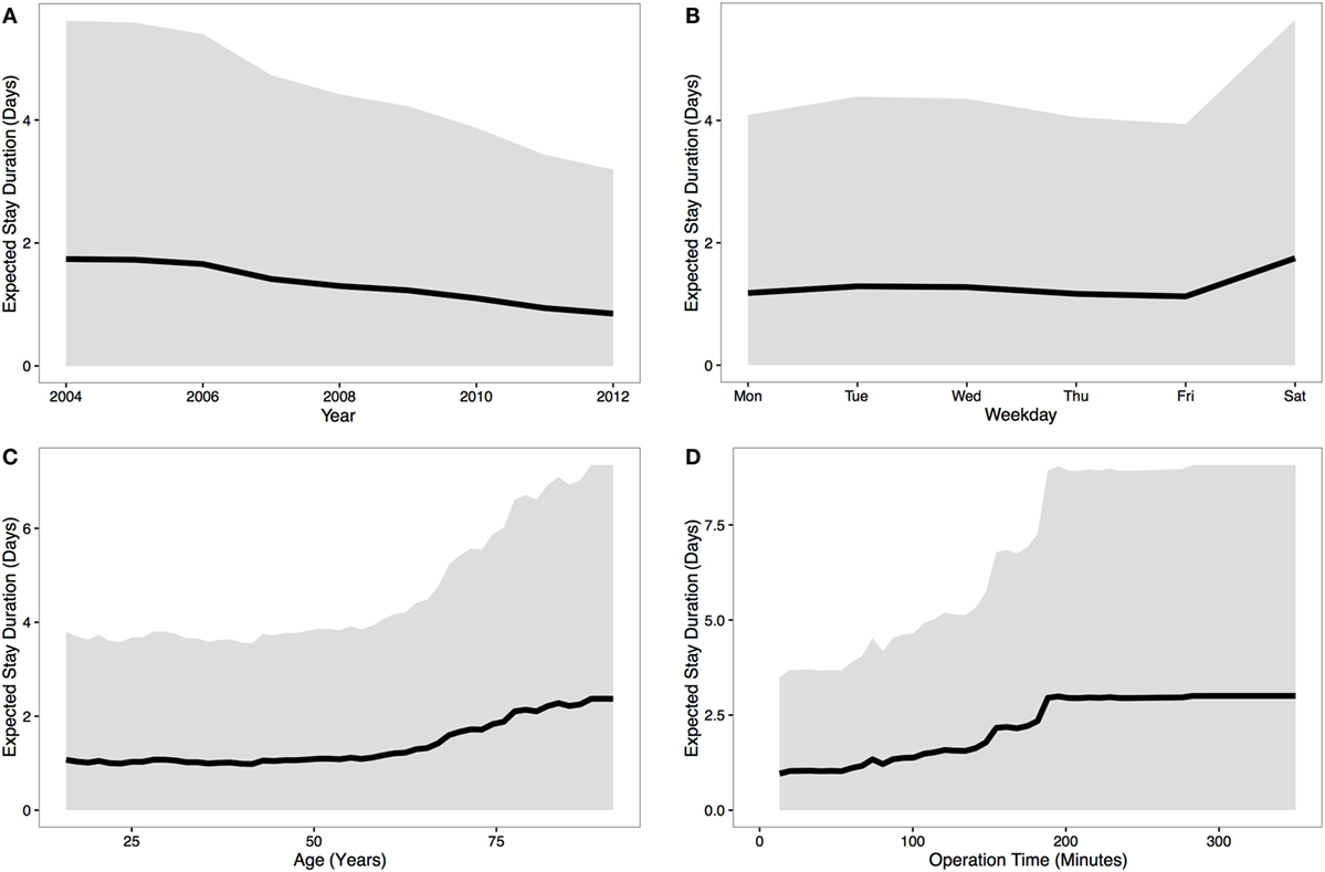
Exploring this possibility, we performed an analysis of data the NHS routinely collects for patients and procedures, such as age, year, day and surgery duration (see figure below), and used this to predict stay duration. Our results showed that a substantial portion of the variability in stay duration could be predicted from these data, which would translate to a significant saving for the NHS if generally applied and combined with current estimates of stay given by experts on the ground from their past experience. Note, importantly, we are not suggesting any intervention on the individual as a result of this analysis. For instance we make no judgement on whether the variation by day indicates anything important about treatment, only that this helps planners to know whats likely to come up next. This work is not about whether the NHS should operate a full weekend service!


The variation in predicted stay duration based on four possible indicators. Black line indicates median prediction, grey region is a 95% confidence interval. From Mann et al. (2016) Frontiers in Public Health

As with numerical weather forecasts, we envisage this supplementing and supporting existing human expert judgement, rather than replacing it - there are clearly facets of the patient that we cannot capture in a simple data analysis. This provides a minimal cost use of existing data, with little or no complicating causal issues, that could save the NHS money on a daily basis. The size of the NHS means that small gains can be amplified on a national scale, while NHS data provides an enormous potential resource. It may be in these unglamorous aspects of healthcare provision that data analytics has immediate potential.
Monday, December 5, 2016

Machine-learning doesn't give you a free pass

A few weeks ago I read this paper on arXiv, purporting to use machine-learning techniques to determine criminality from facial expressions. The paper uses ID photos of "criminals and non-criminals" and infers quantifiable facial structures that separate these two classes. I had a lot of issues with it and was annoyed if not surprised when the media got excited by it. Last week I also saw this excellent review of the paper that echoes many of my own concerns, and in the spirit of shamelessly jumping on the bandwagon I thought I'd add my two-cents.

As someone who has dabbled in criminology research, I was pretty disturbed by the paper from an ethical standpoint. I think this subject, even if it is declared fair game for research, ought to be approached with the utmost caution. The findings simply appeal too strongly to some of our more base instincts, and to historically dangerous ideas, to be treated casually. The sparsity of information about the data is troubling, and I personally find the idea of publishing photos of "criminals and non-criminals" in a freely-available academic paper to be extremely unsettling (I'm not going to reproduce them here). The paper contains no information on any ethical procedures followed.


Aside from these issues, I was also disappointed from a statistical perspective, and in a way that is becoming increasingly common in applications of machine-learning. The authors of this paper appear not to have considered any possible issues with the causality of what they are inferring. I have no reason to doubt that the facial patterns they found in the "criminal" photos are distinct in some way from those in the "non-criminal" set. That is, I believe they can, given a photo, with some accuracy predict which set it belongs to. However, they give no consideration to any possible causal explanation for why these individuals ended up in these two sets, beyond the implied idea that some individuals are simply born to be criminals and have faces to match.

Is it not possible, for example, that those involved in law enforcement are biased against individuals who look a certain way? Of course it is. Its not like there isn't research on exactly this question. Imagine what would happen if you conducted this research in western societies: do you doubt that the distinctive facial features of minority communities would be inferred as criminal, simply because of well-documented police and judicial bias against these individuals? In fact, you need not imagine, this already happens: machine-learning software analyses prisoners risk of reoffending, and entirely unsurprisingly attributes higher risk to black offenders, even though race is not explicitly included as a factor.

If this subject matter was less troublesome, I would support the publication of such results as long as the authors presented the findings as suggesting avenues for future, more careful controlled studies. However, in this case the authors resolutely do not take this approach. Instead, they conclude that their work definitively demonstrates the link between criminality and facial features:
"We are the first to study automated face-induced inference
on criminality. By extensive experiments and vigorous
cross validations, we have demonstrated that via supervised
machine learning, data-driven face classifiers are able
to make reliable inference on criminality. Furthermore, we
have discovered that a law of normality for faces of noncriminals.
After controlled for race, gender and age, the
general law-biding public have facial appearances that vary
in a significantly lesser degree than criminals."

This paper remains un-reviewed, and let us hope it does not get a stamp of approval by a reputable journal. However, it highlights a problem with the recent fascination with machine-learning methods. Partly because of the apparent sophistication of these methods, and partly because many in the field are originally computer scientists, physicists or engineers, rather than statisticians, there has been a reluctance to engage with statistical rigour and questions of causality. With many researchers hoping to be picked up by Google, Facebook or Amazon, the focus has been on predictive accuracy, and on computational efficiency in the face of overwhelming data. Some have even declared that the scientific method is dead now that we have Big Data. As Katherine Bailey has said: "Being proficient in the use of machine learning algorithms such as neural networks, a skill that’s in such incredibly high demand these days, must feel to some people almost god-like ".

This is dangerous nonsense, as the claim to infer criminality from facial features shows. It is true that Big Data gives us many new opportunities. In some cases, accurate prediction is all we need, and as we have argued in a recent paper, prediction is easy, cheap and unproblematic compared to causal inference. Where simple predictions can help, we should go ahead. We absolutely should be bringing the methods and insights of machine-learning into the mainstream of statistics (this is a large part of what I try to do in my research). Neil Lawrence has said that Neural Networks are "punk statistics", and by God statistics could do with a few punks! But we should not pretend that simply having a more sophisticated model, and a huge data set, absolve us of the statistical problems that have plagued analysts for centuries when testing scientific theories. Our models must be designed precisely to account for possible confounding factors, and we still need controlled studies to carefully assess causality. As computer scientists should know: garbage in, garbage out.


This is not a plea for researchers to 'stay in their lane'. I think criminology and statistics both need fresh ideas, and many of the smartest people I know work in machine-learning. We should all be looking for new areas to apply our ideas in. But working in a new field comes with some responsibility to learn the basic issues in that area. Almost everyone in biology or social science has a story about a physicist who thought they could solve every problem in a new field with a few simple equations, and I don't want data scientists to do the same thing. I fear that if modern data science had been invented before the discovery of the Theory of Gravity, we would now have computers capable of insanely accurate predictions of ballistics and planetary motions, and absolutely no idea how any of it really worked.


Sunday, August 21, 2016

A Bayesian Olympics medals table

As the 2016 Rio Olympics draw to a close, much of the media coverage here in the UK focuses on how many medals Team GB has won, and how this compares to other countries and to previous Olympics. Team GB has done particularly well this year, rising to 2nd in the medal table (as of Sunday afternoon) and increasing the number of medals won compared to London - the first time a host country has improved its medal haul in the subsequent Olympics.

The medal table has become an increasingly prominent feature of the Olympics (at least in the UK). Many people have pointed out an simple flaw in looking at a country’s position in the table as a measure of its sporting ‘quality’ (whatever that means): larger countries win more medals, simply by having more people. The USA, China and in the past the Soviet Union have been large countries dominating the upper echelons of the table. The obvious way to compare countries ‘fairly’ is to look at a per capita medal table. One website that has done this places the Bahamas at the top of its list of per capita gold medals. On the one hand correcting for population size in this way seems like a sensible thing to do if you want to know whether a country performed well for its size or not. But I can’t help noticing that of the top 10 countries in this list, none has a population onf more than 10m people, and two have populations below 1m. A single gold medal in the Bahamas puts them top of the list. This suggests to me that places at the top of the per capita table are likely to be the result of statistical noise - whichever of the many small countries compteting manages to win one gold tops the table.

A more robust solution is to treat the medal table as a statistical sample that is generated from the underlying sporting quality of each country, and to try to infer this quality from the data that we observe. To do this we can use Bayesian inference. Let the quality of a country in Olympic sport be represented by a single number, \(q\), such that the expected number of gold medals that country will win is \(qN\), with \(N\) being the population of the country (I’ll ignore complications about differing proportions of athlete-age population). Bayes’ rule tells us that our belief about the quality of a country should be represented by a probability distribution that combines our prior beliefs about \(q\), \(P(q)\) and the likelihood of observing the medals we saw given a specific value of q, \(P(\textrm{# Golds = g} \mid q)\): \[ P(q \mid \textrm{# Golds = g}) \propto P(q)P(\textrm{# Golds = g} \mid q) \] The likelihood is easy to define. Given that gaining a gold is a rare event, the number of golds won should follow a Poisson distribution. Therefore: \[ P(\textrm{# Golds = g} \mid q) = \frac{(qN)^g \exp(-qN)}{g!} \] For the prior distribution of \(q\) we can use the Principle of Maximum Entropy: we use a distribution that has the most uncertainty given the facts that we know. We know what the mean number of golds per person over the whole world must be, since the total number of golds, \(G\) and the world population, \(N_W\) is fixed at the time of the Olympics. The maximum-entropy distribution defined over positive numbers and with a known mean is the exponential distribution: \[ P(q) = \frac{N_W}{G}\exp(-\frac{qN_W}{G}) \] Putting this together and discarding constants we get \[ P(q \mid \textrm{# Golds = g}) \propto q^g \exp \left(-q\left(N + \frac{N_W}{G}\right) \right) \] If we want a single number to represent this distribution we should use the mean value \(\bar{q} = \int_0^1 qP(q \mid \textrm{# Golds = g}) dq\), which we can calculate as below: \[ \bar{q} = \frac{\int_0^1 q^{g+1} \exp \left(-q\left(N + \frac{N_W}{G}\right)\right)dq}{\int_0^1q^{g} \exp \left(-q\left(N + \frac{N_W}{G}\right)\right)dq} \\ = \frac{g+1}{N + \frac{N_W}{G}}\frac{1-\exp(-(N + \frac{N_W}{G}))\sum_{i=0}^{g+1} \frac{(N + \frac{N_W}{G})^i}{i!}}{1-\exp(-(N + \frac{N_W}{G}))\sum_{i=0}^{g} \frac{(N + \frac{N_W}{G})^i}{i!}} \] where the final step is done using repeated integration by parts. In practice the exponential terms in the final expression tend to be extremely small, so this can be approximated as \(\bar{q} = \frac{g+1}{N + N_W/G}\). This shows what effect the Bayesian prior has: the simple per capita estimate is just \(\frac{g}{N}\); using the prior effectively increases the medal count by 1 and the population count by \(N_W/G\), the worldwide number of people per medal, so it is as if the country got one more gold medal at the cost of having an additional population of the worldwide average needed to do this.

So I’m sure if you’ve slogged through the mathematics this far you’re dying to know what the Bayesian medal table actually looks like. Here is the R code used to do the above calculations, and then finally the medal table:

library(knitr)

#Read in data
medal_table = read.delim("medal_table.txt")
medal_table$Population = as.numeric(gsub(",", "", as.character(medal_table$Population)))


#Define prior distribution mean parameter
world_pop = 7.4e9
prior_mean = sum(medal_table$Gold)/world_pop

#Define useful function for calculating posterior mean
myf <- function(n, k){
  s = rep(0, k)
  for (ii in 0:k){
    s[ii] = -n + ii*log(n) - lfactorial(ii)
  }
  
  y = 1 - sum(exp(s))
  return(y)
}

#Loop over countries and calculate posterior mean 
medal_table$Quality = rep(NA, dim(medal_table)[1])
for (i in 1:dim(medal_table)[1]){
  k = medal_table$Gold[i]
  n = medal_table$Population[i] + 1/prior_mean
  
  #Calculate mean of the posterior distribution
  medal_table$Quality[i] = ((k+1)/n)*myf(n, k+1)/myf(n, k)
  
}

#Order results by quality and print
medal_table_print=medal_table[order(medal_table$Quality, decreasing=TRUE), c("Country", "Gold", "Population", "Quality")]
#Print only countries with quality higher than the prior
medal_table_print = medal_table_print[which(medal_table_print$Quality > prior_mean), ]
row.names(medal_table_print) <-NULL

kable(medal_table_print, digits = 9)
Country Gold Population Quality
Great Britain 27 65138232 3.13e-07
Hungary 8 9844686 2.64e-07
Jamaica 6 2725941 2.60e-07
Netherlands 8 16936520 2.19e-07
Croatia 5 4224404 2.11e-07
Australia 8 23781169 1.88e-07
New Zealand 4 4595700 1.74e-07
Germany 17 81413145 1.70e-07
Cuba 5 11389562 1.69e-07
United States 46 321418820 1.36e-07
South Korea 9 50617045 1.34e-07
Switzerland 3 8286976 1.23e-07
France 10 66808385 1.21e-07
Russian Federation 19 144096812 1.19e-07
Greece 3 10823732 1.14e-07
Spain 7 46418269 1.13e-07
Georgia 2 3679000 1.08e-07
Italy 8 60802085 1.06e-07
Slovakia 2 5424050 1.01e-07
Denmark 2 5676002 1.00e-07
Kenya 6 46050302 1.00e-07
Serbia 2 7098247 9.60e-08
Kazakhstan 3 17544126 9.60e-08
Uzbekistan 4 31299500 9.00e-08
Sweden 2 9798871 8.80e-08
Japan 12 126958472 8.60e-08
Belgium 2 11285721 8.50e-08
Canada 4 35851774 8.30e-08
Bahamas 1 388019 8.10e-08
Fiji 1 892145 8.00e-08
Bahrain 1 1377237 7.80e-08
Kosovo 1 1859203 7.70e-08
Slovenia 1 2063768 7.60e-08
Armenia 1 3017712 7.40e-08
Puerto Rico 1 3474182 7.20e-08
Singapore 1 5535002 6.70e-08
Jordan 1 7594547 6.30e-08
Tajikistan 1 8481855 6.10e-08
North Korea 2 25155317 6.10e-08
Belarus 1 9513000 5.90e-08
Argentina 3 43416755 5.90e-08
Azerbaijan 1 9651349 5.90e-08
Czech Republic 1 10551219 5.80e-08
Colombia 3 48228704 5.50e-08
Poland 2 37999494 4.80e-08
Romania 1 19832389 4.50e-08
Ukraine 2 45198200 4.30e-08
Cote d’Ivoire 1 22701556 4.30e-08
Taiwan 1 23510000 4.20e-08

Team GB tops the chart! Mathematically, this is because GB combines a large rate of medals per capita with a large population. Therefore it has the statistical weight to move the inferred value of \(q\) away from the prior expectation. Smaller countries with several golds like Jamaica also do well, but tiny Bahamas is now much further down the list - 1 gold medal just isn’t enough information to tell you much about the underlying rate at which a country tends to win golds.

You could easily extend this analysis by aggregating the results of previous Olympics too. With data from more years there would be more evidence to move the quality of smaller countries away from the prior. In terms of predicting the future performance of countries you would need to decide on an appropriate weighting of past results, which you could in principle do by trying to make a predictive model for the 2016 results from 2012, 2008 etc. Data from Rio and previous Olympics is available here

Additional note: this is my first blog post written entirely in R Markdown.